
A logo is more than a graphic design. It is a visual representation of a brand, business or product. For organisations and companies, it is a corporate symbol that reflects their image, efficiency and reliability. A well-designed logo can be iconic and remain recognisable for years or even decades.
Below are some of the most recognisable logos in Singapore.
Housing and Development Board (HDB)
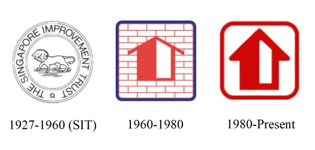
The Housing and Development Board (HDB) was established on 1 February 1960 as Singapore’s public housing authority, taking over the role from the Singapore Improvement Trust (SIT).
The first HDB logo comprised a house symbol in a blue square frame with red brick-wall background. The colours of red, blue and white were HDB’s corporate colours, and the bold, angular lines matched the design styles of the sixties and seventies. The HDB logo represented the statutory board’s mission to provide basic homes for Singaporeans.
![]()
In March 1980, HDB changed its logo to a new one, where the design emphasised on the simplicity of form. The new HDB logo looks similar to the old one, retaining the identity through the home symbol and the square frame that represents the housing environment. HDB also continued the use of the dominant red colour for its new logo.
Public Utilities Board (PUB)
![]()
The Public Utilities Board (PUB) was established in 1963 as a statutory board to coordinate and manage the supply of electricity, water and piped gas for Singapore. Its first logo was made up of a circle containing a cluster of buildings and chimneys emanating smoke. In 1977, PUB housed all its departments from City Hall into its new PUB building at Somerset Road and, in the same year, introduced a new logo.
![]()
Designed by local graphic designer Eulindra Lim, the new PUB logo had symbolising elements of the three utilities in electricity (centre jagged line in red), water (bottom arc in dark blue) and gas (top arc in light blue), while retaining the circle shape that signified the 24-hour service. The new logo, modern and reflective of a progressive organisation, went on to be arguably one of the most recognisable logos in Singapore.
![]() In 1988, PUB introduced an animated version of their logo, called Flash. With a mission to teach students the safe way of using electricity, Flash came in educational kits given free to all schools. The kits were made up of animated videos, colour booklets and leaflets with information on the types of approved accessories and tips on choosing electrical appliances.
In 1988, PUB introduced an animated version of their logo, called Flash. With a mission to teach students the safe way of using electricity, Flash came in educational kits given free to all schools. The kits were made up of animated videos, colour booklets and leaflets with information on the types of approved accessories and tips on choosing electrical appliances.
PUB was reconstituted in 2001 to become Singapore’s national water authority; the regulation of electricity and gas industries were transferred to a new statutory board called the Energy Market Authority (EMA). The PUB logo was refreshed again in 2016 with three swirls in different blue shades, as a mimic to a water cycle. The three swirls represent PUB’s functions in water services, sewerage and drainage, whereas the three blue shades symbolise the water sources in seawater, reclaimed water and catchment water. PUB is also rebranded as “PUB, Singapore’s National Water Agency”.
Post Office Savings Bank (POSB)
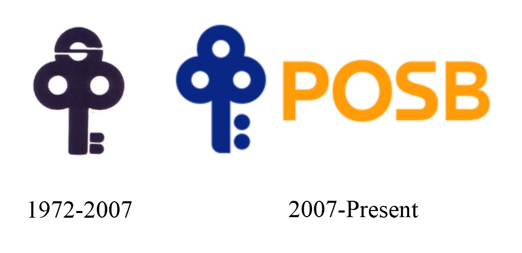
The Post Office Savings Bank (POSB) was founded by the British colonial government in 1877. Almost a century later, in 1972, the bank became a statutory board under the Singapore government to provide more efficient services to its customers.
The POSB logo was first unveiled in April 1972 at the opening of the bank’s Toa Payoh branch. Designed by William Lee of Centre Design, the key-like logo, cleverly made up of the bank’s P.O.S.B initials, symbolises security and prosperity. The logo also resembles a tree which represent life and growth. These attributes were incorporated by POSB while at the same time identifying with the green city of Singapore.

POSB changed its name to POSBank in 1990. Eight years later, in July 1998, it was acquired by the Development Bank of Singapore (DBS) for $1.6 billion, ending its role as a statutory board. The POSB logo was given a refresh in 2007, after 35 years. The new design is a simplified form of the old logo, with the name POSB added to it.
Singapore Bus Services (SBS)
![]()
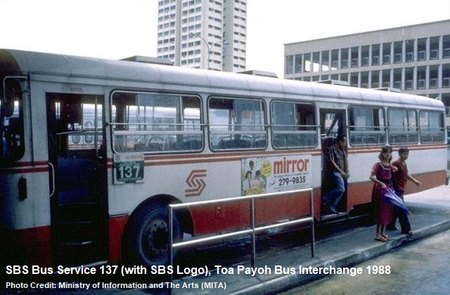
The Singapore Bus Services (SBS) was formed in 1973 through the merger of Amalgamated Bus Company (ABC) Ltd, Associated Bus Services Pte (ABS) Ltd and United Bus Company (UBC) Ltd. The three bus companies, operating in different parts of Singapore, were easily identifiable through their fleets of blue, red and yellow buses.
After the merger, SBS designed a circular tricolour logo in the shades of blue, red and yellow, symbolising the amalgamation of the three bus companies. Most of the early SBS buses, however, did not carry the logo.
![]()
In 1978, SBS introduced its second logo, also designed by William Lee. As buses were moving objects, any logo designs used should be easily recognisable and remained pleasant in the mind, explained William Lee.
Hence, in his logo design, the arrows were in flowing movement and the circle in the middle of the arrows suggested SBS’ efficient management of the transport system and centralised planning. The red and pink lines of the same contours extending left and right allowed the new SBS logo to be painted on both sides of the buses.
![]()
SBS welcomed its third logo in 1983. In the new logo, the arrows in opposite directions signified the operation of its comprehensive network of services. The bold red colour depicted the growing strength and dynamism of the bus company, whereas the white spaces represented its harmonious relationship with the passengers. This SBS logo, arguably its most iconic version, lasted until 2001 when SBS became SBS Transit Limited in a rebranding exercise.
Jurong Town Corporation (JTC)
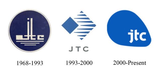
Established in June 1968, the first Jurong Town Corporation’s (JTC) logo was made up of JTC’s initials and resembled a factory with a chimney that emits a puff of smoke. There were three horizontal lines at the bottom, representing Kallang River, Jurong River and Kranji River, the three rivers in Singapore where JTC industrial estates were built.
Entering the eighties, however, factories with chimneys were often associated with sunset industries like steel-making. This made JTC’s logo look outdated. In 1988, JTC invited design, public relations and advertising agencies to create a new logo and corporate identity to better and more accurately reflect the statutory board’s role as an industrial authority.
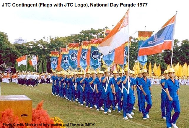
In 1993, JTC introduced its new logo, which had a tilted solid square that symbolised its firm focus in the development and management of industrial facilities and infrastructure. The horizontal lines beside the tilted square represented JTC’s aim to venture into new realms both locally and internationally.
JTC unveiled its third logo in 2000 when it was corporatised and renamed from Jurong Town Corporation to JTC Corporation. The new JTC logo features a fluid shape that symbolises the organisation’s adaptability in a new economy.
United Overseas Bank (UOB)
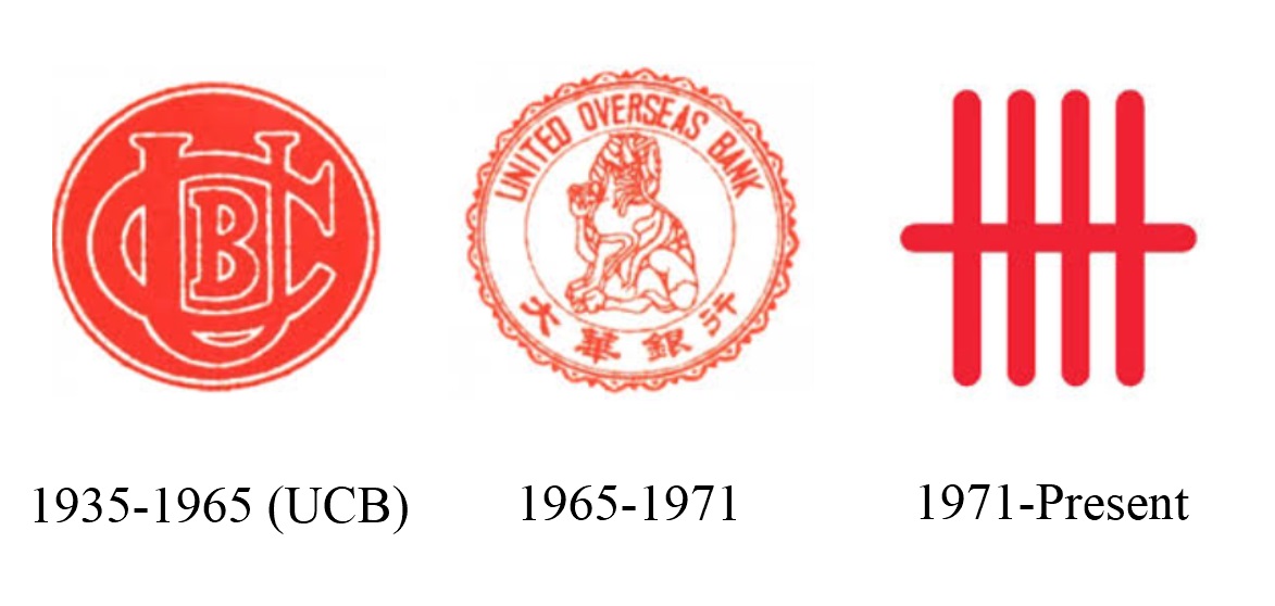
The United Overseas Bank (UOB) was first known as United Chinese Bank (UCB), founded in 1935 by a group of local businessmen to serve the merchant community in Singapore.
It was renamed UOB in 1965 to avoid confusion with another bank in Hong Kong that had the same United Chinese Bank name. To commemorate the change in name, UOB introduced a new logo bearing the new name, in both English and Chinese, and a Chinese lion at the centre.
![]()
UOB’s simple yet iconic logo was created in 1971 and remains in use today. The five-bar gate symbol of the logo was derived from the traditional Chinese way of counting in fives, representing security and unity. The simplicity of the logo also reflects the bank’s focus and clarity.
Popular Bookstore
![]()
Having its early roots under the trade name of Cheng Hing Company in the 1920s, Popular Book Company was officially established as a Chinese books seller in 1934. It was, however, more than half a century later before Popular launched its recognisable logo.
In 1989, Lai Chee Kien, a lecturer from the National University of Singapore’s (NUS) Department of Architecture, won the logo design competition for Popular Bookstore.
The logo comprises the simplified Chinese character of “crowd”, made up of three “person” and resembles three opened books stacked atop one another. This also symbolises that it is a place where people and books come together.
Refer to Singapore Graphic Archives for more Singapore’s graphic design collections.
Published: 31 July 2025
Discover more from Remember Singapore
Subscribe to get the latest posts sent to your email.


Very informative site. Keep up the good work.
Yes I remember United Overseas Bank (UOB) and Post Office logo when I was in school in the late 70’s – bring back so muh memory eventhough I have not been in living in Spore in the last 30 odd years.
where did the flash guy from the PUB come from I cannot find any info on him lmao
The first one I noticed was Pacific Internet. My first Internet provider. 😉
I miss them.